

Monday, December 29, 2014
Spider Magazine Cover
I'm really excited to share this cover with everyone! It's been a long time coming but I can finally say that I've illustrated a magazine cover. I can't think of a better way to start off a new year. Happy Holidays!
Saturday, December 20, 2014
New Illustrations for Clubhouse Jr.
Merry Christmas everyone!
I just got my copies of the December issue of Clubhouse Jr. Inside are my illustrations for a cute story named The Reindeer Who Missed Christmas.


I just got my copies of the December issue of Clubhouse Jr. Inside are my illustrations for a cute story named The Reindeer Who Missed Christmas.
Tuesday, December 2, 2014
MOO-ving Right Along
Just finished my fourth and final promo piece for the year. Recently, Photoshop has been getting annoying with me, so with this illustration I actually did a good portion of the coloring using Manga Studio. This was my first real attempt at rendering using the new software so obviously it took some getting used to. Definitely some more experimentation with custom brushes and color modes needed but I wouldn't be at all surprised if I decided to go with Manga Studio all the time.

Friday, October 17, 2014
New Catalog
Here's the latest promotion catalog by MB Artists. The theme this time is school. Enjoy!

Here's the link: http://www.mbartists.com/cgi-bin/iowa/catalog.html
Here's the link: http://www.mbartists.com/cgi-bin/iowa/catalog.html
Friday, September 19, 2014
A School of Class Pets
Here's a sneak peek at my latest promotion piece. The theme this time is school. Like always, I wanted to have some fun with it.

Just one more promo piece to go for this year...gives me a couple months to procrastinate!
Sunday, August 17, 2014
Yet Another Cintiq Companion Review
By now, most digital artists have heard of the Wacom Cintiq Companion and what it does, so I'm not going to bore everyone reviewing the basic specs. In fact, Norm wrote a nice review awhile back covering just that- LINK. I wanted to give my personal take on the machine as an illustrator and as a user who has put the Companion through it's paces for the last 8 months or so.

The Good
The Bad
The Ugly
The Good
- Natural Drawing: Before I purchased the Cintiq Companion, my digital illustrations were created using Wacom tablets. The main reason I made the switch was because I wanted something that could mimic the more natural feel of drawing and painting traditional. As good as tablets are, you can't recreate the same direct relationship between your hand and eyes while you are drawing. This is where the Companion has me sold; and even after years of working on tablets, it only took several hours for me to feel comfortable making marks on the Companion.
- Portability: Another big reason I decided to go with the Companion and not one of the larger-screened Cintiqs out on the market was that this had a built in computer. This made working on the go a true possibility. In fact I've spent hours at a time working in my car, with a battery life of about 3 hours, I've found a real use for my Companion outside of my studio. The only caveat I have working outside when it's bright outside can be a bit difficult.
- Performance: I'm really impressed by the processing power of the Companion. In Photoshop, my files can be as big as 150mb yet there is no noticeable lag.
- Customization: Wacom has really done a good job making this product user-friendly. Being a Photoshop-user who relies on a lot of keyboard shortcuts, I was concerned about compromising my workflow on the occasions where I didn't have access to a keyboard. To my surprise however, with the abundance of customizable shortcut keys (express keys on the side of the Companion as well as the onscreen shortcuts), really once you have everything customized to your liking, I found I could work easily without the keyboard. Right now, I mainly decide whether to use a keyboard based more on screen space rather than efficiency.

A screen shot of my Companion. Along with the express keys that are off screen (mainly for brush and erase tools), you can see that you have a lot of flexibility, plus I still have room for more if I need them.
The Bad
- The Stand: Compared to the quality of the Companion itself, the stand almost feels like an afterthought. Though it does a reasonable job while the device is firmly resting on a hard, flat surface, such as a desk; if I decide to move it around, there's a good chance it'll slip off it's notch and collapse down. This is especially true when I have it resting on the most vertical setting. To me, it makes a lot more sense for the stand to be permanently attached. Since it has the ability to fold flat anyway, I haven't found a reason to not have it attached...and it's not like it adding a lot of extra weight.
- Scratches: Within a week or two after I started using my Companion, I noticed I had a scratch on the screen. The thought of my beautiful new machine covered with scratches put me in a panic, so I quickly ordered a screen protector. After about 4 months with the screen protector on I'm still noticing an increasing number of scratches. These are minute scratches mind you- that you only really notice when you have blank white areas on the screen. Personally, I don't think I'm heavy-handed when I draw, and my nibs don't really show signs of wear, so I'm left wondering if this is just a common thing for Cintiqs. All I know is that replacing screen protectors will be part of my routine.
- The hiccups: When my Companion is running well, it's a great tool to work on, however I have noticed more instability issues with Photoshop than normal. These crashes were not caused by me overworking the processor, so my guess is that it may be Windows 8 related. Also there has been a tendency for my onscreen shortcuts to malfunction or my stylus or onscreen keyboard to not respond. This tends to happen if I accidentally hit too many shortcuts at the same time or too quickly. Other issues happen when I have my Companion coming out of sleep mode or screensaver. I tend to point my finger at Windows 8 and Wacom compatibility issues.
The Ugly
- No Charge: About a couple months into using my Companion, the battery inexplicably decided not to recharge when it was plugged in. This became really frustrating because I would be working and my machine would just shut down on me without any warning and all the work that wasn't saved would be lost. The first couple times this happened, my Companion was able to hold a charge partially if I played with the connections. But in a matter of a week or so, it recharged for the last time and was basically dead. Fortunately, by then I had prepared for this and backed up all my files, but it was of little comfort. After contacting Wacom, I was left with sending my Companion back for repairs. Three weeks later, I received a package from Wacom and to my surprise, rather than fixing my Companion, they ended up sending me a new one. And the new Companion is charging like it should...for now.

Seeing double...after returning my broken device back to Wacom, they decided to send me a new one rather than repair it. So now I have two nice boxes for my trouble.
Despite having it's fair share or glitches and imperfections, the Cintiq Companion is still a great tool and the best portable drawing device I've ever worked with. With it, I have been able to produce my illustrations without sacrificing any quality or efficiency... if anything, it has improved it. A lot of the issues I have with the Companion, I chalk up to Wacom venturing into new territory. I can only imagine if they do decide to come out with a second generation model, it would simply be great.
Tuesday, August 5, 2014
Playing Around
Recently, I've been playing around with different programs. Being a creature of comfort, it really took a bit of effort for me to get out of my Photoshop routine and try a new program. So this past week, I've worked with both Adobe Illustrator and Manga Studio, and I'm glad I did, I definitely made some discoveries and I think I made some real progress in being comfortable using them.
Here's a quick, B&W piece I did in Manga Studio. I was really impressed with the fluidity of the lines I was able to achieve with the program. I came see myself using this program if I ever needed to do more polished B&W illustrations.

Here's a quick, B&W piece I did in Manga Studio. I was really impressed with the fluidity of the lines I was able to achieve with the program. I came see myself using this program if I ever needed to do more polished B&W illustrations.
Monday, July 7, 2014
New Catalog!
Hi all! The latest promotional catalog has just been released. Hard to believe this will be the tenth one. The theme of this catalog is FOOD...YUM!
Here's the link:
http://www.flipsnack.com/AC98DF86AED/fun8bfq0
Here's the link:
http://www.flipsnack.com/AC98DF86AED/fun8bfq0
 |
Sunday, June 8, 2014
My First SCBWI Illustrator Intensive
I recently attended my first Illustrator Intensive hosted by my regional chapter of SCBWI. For several years I've wondered whether these workshops were really worthwhile. And after some thought, I decided to feed my curiosity and see for myself...and what I found was a mix of both good and bad. I wanted to share my experience with everyone.
But before I go any further, I wanted to quickly go over the general setup of the intensive. Along with an option for a portfolio review, the main event of the intensive were the advanced exercises. Participants were given a choice between two exercises, one by each of the two speakers. Our speakers for our intensive were Loraine Joyner, Senior Art Director at Peachtree Publishers, and Ronnie Ann Herman, Artist Rep at Herman Agency. We were required to start on our exercises prior to the actual day of the intensive, and we would bring our work and get feedback and share with the group. Loraine's exercise involved choosing a story from three selected manuscript and with that, we were tasked with creating character concepts, a 32-page storyboard, one tightly rendered sketch, and finally a finished color illustration. Ronnie's exercise was slightly different, she had two basic scene ideas. For each scene, she wanted characters sketches, a rough sketch, and a finished illustration.
I ultimately went with Loraine's exercise. I thought it was the more challenging of the two, and developing a storyboard was something I felt I could use more practice in. For this exercise, we had about two months to create the character concepts, storyboard, and tight sketch, with a two week deadline to complete each portion of the exercise. As we finished each part, we turned in our work via dropbox our regional adviser with SCBWI. Once we had everything submitted, the work was then forwarded to Loraine and she critiqued it. We would then take her comments as we worked on our final colored illustration. This was presented on the day of the workshop and shared with the group.
Below are my two character concepts for the story I selected. For my exercise, the main characters were a zebra and a lion;
And here is my finished illustration.
The main highlights of the intensive include;
- After meeting Loraine in person, I definitely felt I made the right choice in working with her, I thought her presentation was very informative and she had a lot of useful nuggets to share.
- Loraine gave my work a very thorough critique, and made some really good comments.
- The day reminded me of my time in art school, and I enjoyed the energy in the room. Everyone was engaged and eager to learn.
- The day long intensive allowed for time to catch up with some friends and fellow illustrators who also attended. It's always nice to be able to "talk shop" with other people who know can relate.
On the flip side, here are some things I wish were better;
- Poor communication was a big source of frustration for myself as well as other attendees I spoke to. Some of this blame fell on the shoulders of the regional adviser that was collecting the work. To me, she gave the impression that she wasn't receptive to any questions we might of have.
- For the better part of this venture, I personally didn't feel like I had anyone I could go to for questions. And this almost ended up in disaster! It was unclear whether we were required to complete a finished illustration, and in the end, I had to rush at the last minute to get it done.
All in all, I'm glad I decided to do it at least once. Would I do it again...probably not. I really enjoyed being in the company of "my" people. It was reminiscent of my college days. And though it felt like this workshop catered more for novices and the inspiring, I still walked away feeling recharged and inspired. I recommend these workshops for those who might need that extra bit of motivation, or for someone looking to get a little taste of an art school class setting.
Monday, May 5, 2014
Who Inspires You?

Please check out my latest post over at Once Upon a Sketch. In it I asked the question; who inspires you? As a fan of illustration, I'm always curious to see who other artists admired, so it was fun to get some insight into who my fellow contributors picked as some of their favorite artists.
Here's the link: http://onceuponasketch.com/2014/05/who-inspires-you/
Friday, April 18, 2014
Promo Catalog: Transportation
 |
| Have a look inside! |
Tuesday, March 11, 2014
Winthrop Little Has Arrived!
Exciting news! The Memoirs of Winthrop Little has just been released on the App Store!


.jpeg)
.jpeg)
I had a really fun time creating the illustrations for this charming story about two teddy bears getting into all sorts of hi-jinx as they embark on Operation Birthday Cake!
Here are some shots of the app;
To purchase please visit the Winthrop Little Website or HERE on the App Store. Please spread the word!
Monday, February 24, 2014
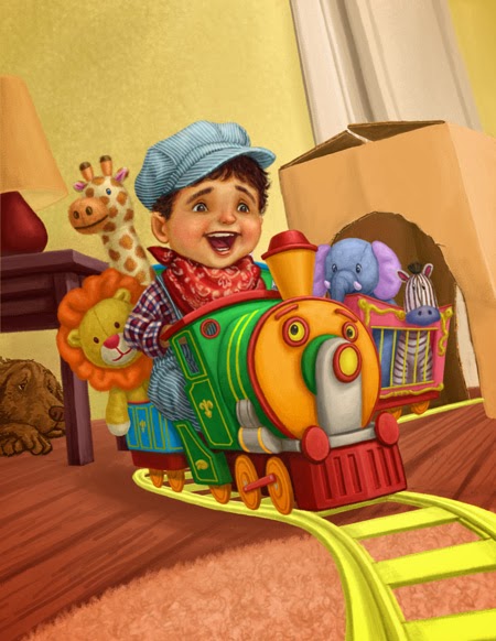
Make it Work

The illustration was inspired by my son, who happens to be obsessed with trains at the moment. I wanted to share my process with everyone, so please follow along as I go from the initial sketch to the final illustration;
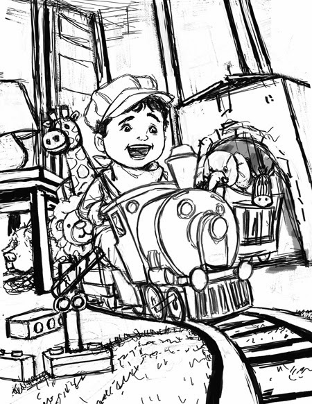 |
| With any illustration, I started with the sketch. This was done in Photoshop. At this point, I was still not completely satisfied with the background or the foreground elements. Typically, if this was for a client, I would make sure to resolve everything before moving on...however, since I was essentially doing this for my own indulgence, I decided to plow ahead and see where things would take me. One of the luxuries to being your own art director is that you get to explore and react to a piece as you are developing it. But before I moved onto colors, I duplicated my sketch layer. One layer, I left at the very top of my layer stack, this will be left invisible and set to multiply. This layer would only be turned on if I needed to refer to my sketch later on as I rendered. My second layer was put at the very bottom of my stack. |
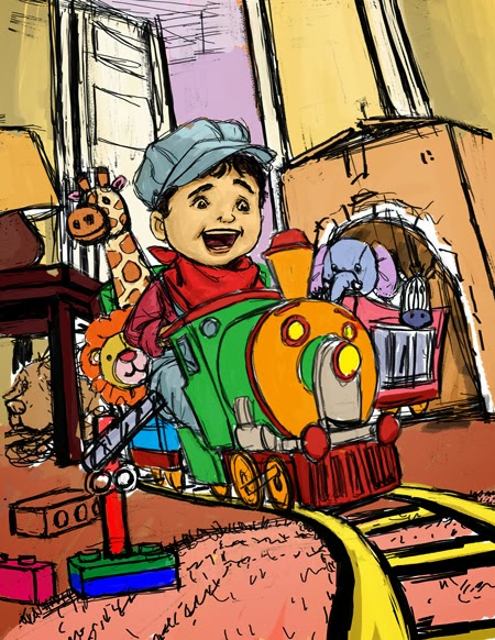 |
| The next step was to introduce colors. I laid down my basic local colors on a separate multiply layer. This layer is sandwiched between my two previous sketch layers. This way I was able to apply colors fast without having to worry about losing any of my line work. |
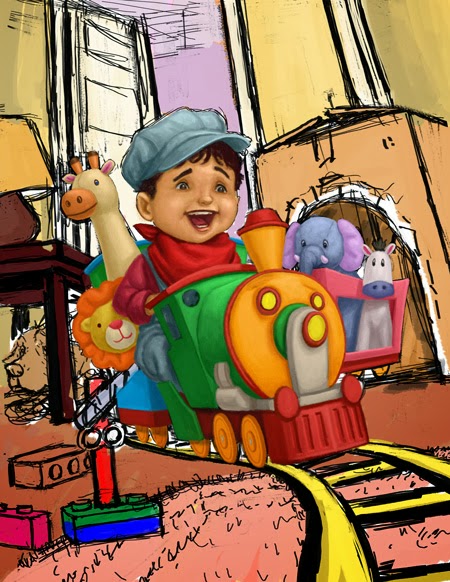 |
| From there, I created new layers for each object(i.e. boy, train, dolls, etc.), and I rendered out the main elements of the illustration. At this point, I only focused on the light and the form, still remaining in my local colors. I established my light source, which is coming from your upper-right hand corner. Since these layers were left as normal layers, I am slowly covering my line work underneath. |
 |
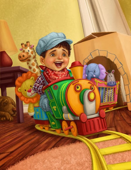
| I repeated the same process for the rest of the illustration, this included the background. As I began to add my door, I played around with the placement of it. And as soon as I placed it to the far right, I really liked what it did for the composition. Not only did it essentially open up the room and create more sense of depth, it naturally flowed with the way the tracks receded into space. Another change I decided to make was the direction my dog was facing in the corner. By flipping him over, I thought he now flowed more naturally with the direction of the action. |
 |
At this point I went back to my main elements and gave each a second pass. With my main forms and shapes already established, I am now free to focus on the details. Here's a detailed before-and-after of the boy. With the second pass of the face, I used a layer set to soft light to create the richness and the blush in the cheeks and nose. The soft light layer allowed me to glaze on color without losing any of the brush work underneath. And I'm always amazed at how a couple simple touches of color can bring a face to life. With the patterns and designs on the fabrics, I used a blend of overlay, soft light, and color layers. This was made easier by creating clipping masks for the separate patterns. Below is a screen shot;  (The clipping mask are represented by the arrows pointing down to it's "parent" layer, this is why some refer to this as "parenting") By parenting my layers, it allowed me to freely make strokes without worrying about the marks breaking beyond the silhouette of the parent layer. I played with the opacity and the blend of each layer until I came up with a combination I liked. |
 |
| With the details of the main elements done, I turned my attention to the background. The detailing was accomplished much in the same way. |
 |
| With the main parts of the illustration addressed, I focused my attention to the foreground. At this point of the process, I had hoped to have a clearer idea of what to do, but that wasn't the case. So a lot of this was done through trial and error. I played with the idea of adding several different toys, from legos, to plastic trees, marbles and even a pillow. Finally I ended up with this makeshift guard rail. I thought compositionally, it helped to further direct a viewers eyes through the illustration. In addition, I also, included a hint of a couch on the left, and the ceiling trim at the upper-left corner. These served as part framing element and further established that this is a living room. |
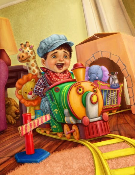 |
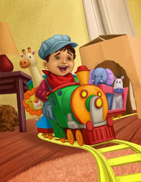
| All there was left to do was the finishing touches. I added the brightest highlights to punch things up. These were mainly reserved for the specular highlights on the train. I also added a cooler light source coming from the left. This gave the objects that extra bit of volume, as well, it helped unify everything. Lastly, I made some minor adjustments here and there and I officially called it one completed. |
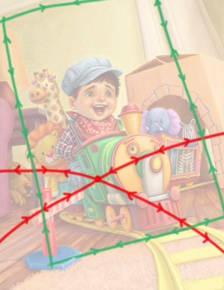 |
| Highlighted are the directions a viewer's eyes travel through the composition. In both cases, I have created movement drawing the eye back to the main focal point, which are the boy and the train. |
Overall, I am really satisfied about how my illustration turned out. And I'm especially happy with the composition. Although, I didn't have everything planned right from the get-go, I continued to search for solutions as I painted. I have often praised this medium for the freedom it gives me when it came to editing. I can play and test things without any worry, and with my illustration, I really took advantage of.this. The lesson I learned here is to remain open to experiment, and not to just settle on the first thing that comes. And if this means deviating from the sketch, go for it. In short...just Make it Work!
Monday, January 20, 2014
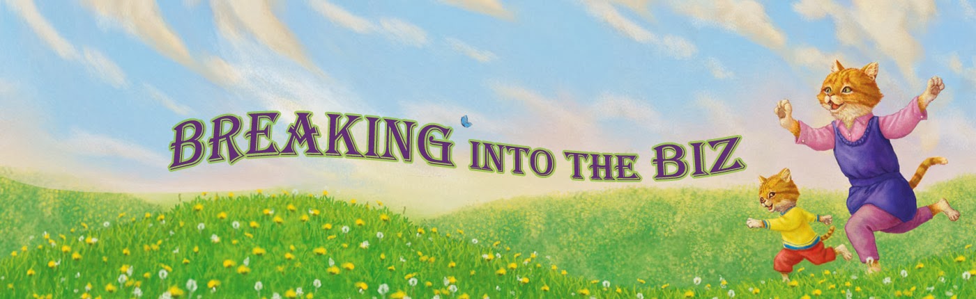
Breaking Into the Biz
For my first post for Once Upon a Sketch a couple months ago, I wrote about tips on how to build a solid portfolio (Here's the link). With the relaunch of the site, I figured now would be a good time to continue that theme and so today’s topic will be “Breaking into the Biz”; what to do once you have that portfolio. Although, I think having a strong portfolio is still the most vital part in landing work, having the best portfolio won't help you one bit, if your work never gets in the hands of the people who need to see it! So here is a list of ways to get your work out there and get your foot in the door:
- Digitally - Your portfolio in digital format:
- Website - In today's world, it's practically a requirement to have a website of some kind where you can showcase your work. Not only does a website serve as a digital representation of your physical portfolio, it's also the most efficient way to reach the masses. Here are a few general ideas to keep in mind when designing your website:
- Remember your website is merely a means of highlighting your art, so like your physical portfolio, the art is what's important! So your site must be clean and simple to navigate. It's okay to have a few bells and whistles to spruce it up, but keep in mind that people generally have very short attention spans (for instance, mine is about 3 seconds), so if your site takes forever to load because of a fancy animation, it's not doing you any favors. Also, a good rule of thumb is to make sure your artwork is accessible by no more than two clicks of a mouse.
- One of the benefits of having your own website is that you are not limited to 12-16 images. So you can be more liberal about what you want to include in your site. But keep in mind that you'll want to make sure your best work gets seen, so make sure they are placed where people will see it first.
- The style of the site matters too. Meaning the overall look of your site should share a similar style to your art. Not only does it make for a more single, cohesive and harmonious package, you won't confuse your viewers.
- Your work should be categorized appropriately. It seems pretty obvious, but you should definitely arrange your work in a logical and orderly fashion...I can definitely spend all day talking in detail with suggestions about grouping and organizing your artwork, but that could be a whole post in and of itself.
- Blog - A blog is a good way to interact and connect with people of similar interests. A blog can be your digital journal, where you can write about anything relevant to your craft. However, a blog can also serve as a good addition, or possibly in place of your website altogether. If you happen to be someone who doesn't have the knowledge or access to creating a website of your own, then you can simply fashion your blog like one. Not only are they easy to design, by creating "posts" that can act as the categories in a website (i.e. portfolio, bio, books, etc.), it can still achieve in getting your work seen.
- Directories - There are a number of websites out there that specifically advertise to Art Directors and other interested parties. Picture-Book and Childrensillustrators are two that come to mind that cater to the children's market. For a fee, you can have your portfolio be included. Some of these websites also provide printed material but I will discuss that below in the print category. I personally have mixed feelings about sites like these and their effectiveness. Because of the nature of how these sites work, you are put in a sea of hundreds of other illustrators without much control as to who sees your work. I'm sure if you ask around, you will also find testimonials of illustrators finding work this way as well, so it does happen. I suggest you weigh the cost versus the benefit.
- Social media - Whether it's Facebook, or Twitter, or Pinterest, it's all about getting your name and work out there in cyberspace...cause you never know who's watching. Facebook for example, has a myriad of groups you can join that cater more specifically to others that share your interests. These can be a great networking tool and a way to direct traffic to your site and ultimately your work. The best part is that they don't require a lot of work, time or cost on your part.
- Forums - A forum is an extension of social media, you are again networking, making a name for yourself and getting your work out there with people that share your interest. If nothing else, sometimes it's just nice to have a place to talk shop, share stories, or get feedback from others that can relate.

- Physically - With your bound portfolio in hand:
- Conferences - For those looking to get into children's publishing, SCBWI (Society of Children's Book Writers and Illustrators) is probably the first name that comes to mind. Not only do they hold two big conferences each year, the regional chapters also hold many events in your area. At these functions, you will be able to meet with art directors, agents, other illustrators and other key players in the field. Some of these conferences will even give you an opportunity to sit down face to face with one of these people and have them view your portfolio. Definitely a rare thing in this day and age...which leads me to the next item on the list.
- Face to face - If you happen to be fortunate enough to be in the position to meet with an Art Director in person definitely make the most of it. Treat it like a job interview, because for us, this will be the closest thing to it . So be prepared, courteous, and most of all, PROFESSIONAL! Back when I was fresh out of college, this was more of the norm; to track down the phone numbers and email addresses of Art Directors you want to work with and try to set up a meeting. I suppose these still can and do happen today, but due to an ever increasing fast-paced world, I would guess most would rather you send them work electronically or through the mail. However, be on your toes! I once had an impromptu meeting with a publisher at a dragon boat race, so you never know when lightning will strike.

- Print-based - Snail mail:
- Postcards/promos - I'm personally a fan of postcards. When it comes to deciding on the art, It should certainly be a stronger, if not the strongest piece in your portfolio. Obviously, your postcard is meant to be a tiny sampling of your collective work and skill set. Choosing a piece that best represents this is critical. Here are some other common questions when it comes to postcards;
- Does size matter? Yes and no. Honestly, I think it really comes down to personal preference. And not just the preference of the sender, but also the recipient. I have heard some Art Directors in favor of your traditional 4x6 postcards while others say something larger has more impact. For the sender, the additional cost of the printing as well as the postage is something to consider. Ultimately, regardless of whichever size you decide, it's about the image you choose.
- How often should I send one? Again there's no written rule here, the consensus seem to dictate somewhere between 1-4 times a year. Personally, I would base my answer on what image I have to use, as well as how updated my portfolio is at that particular time. Let me elaborate; to me, I liken a postcard to a teaser or a trailer to a movie. The goal of a trailer is to amp up your audience before seeing the movie and entice a viewer to then go watch the film. For us the goal is the same, the illustration we choose needs to WOW a viewer and get them to go check out more of our work. So to make it worthwhile, we need to be very selective, otherwise, your card will just get tossed in with the pile of others. Furthermore, you should also consider the state of your portfolio, for instance, if someone sends out 4 postcards a year but fails to update or add more pieces to their portfolio, then you are ultimately selling the same product over and over again. To use my movie analogy, it's kind of like showing trailer after trailer to someone who has already seen the movie. So you definitely need to ask yourself; is your "movie" worth seeing multiple times. If not, I would make sure you have something new to show.
- Directories - Similar to their digital counterpart, the premise is the same. You pay for a spot and they include you in their book. Some companies, like Picture-Book, host both a website and an annual printed directory. These directories are sent to all the publishing houses. One trend I have noticed is that with the decline of the economy these past couple of years, the amount of pages these directories hold has also declined. This may or may not be a good thing because now you have less competition, but this may also mean that they might be falling out of favor to some. Again I would weigh cost versus benefit.
So here are my suggestions on how to get your work out there. Of course, these are not to ONLY ways to go about it, I'm sure we have all heard of stories about talent being discovered in the oddest of places. My advice to everyone is to do as much as you can within your budget. But regardless of what you choose, the one thing that holds true about everything I've mentioned is that all of it takes a proactive attitude. And once you find some success, this attitude doesn't change because just like your talent, you have to continue to work and nurture it and continue to get better at it. The reality of it is, there are no secret handshakes and it's not even about who you know, the formula is simple; create a strong portfolio and then go out there and get it in front of the right people. Good luck out there!
Wednesday, January 1, 2014
Once Upon a Sketch
Happy New Years! Looking forward to a new year filled with new adventures. With that in mind I'm delighted to announce that Once Upon a Sketch is back and I am thrilled to be part of this wonderful, collaborative team of talented professionals. One thing I learned this past year was the importance of networking with other creative types like myself, not only was it nice to share common ideas and frustrations, but it was motivating to contribute in some small way to the world of children's publishing.
Please check out the site!

Please check out the site!
And to close out the year, again I traded in my digital brushes for real ones and I painted a watercolor portrait to celebrate the life of a name I only knew from stories told by my wife. Stories about biker rallies and Alaskan fishing adventures. Here's to you George.

Subscribe to:
Posts (Atom)